What I built.
Credence Website is part of my portfolio of websites and applications.
- Brand-led coming-soon experience.
- Earlier Nuxt implementation with contact-form submission.
- Separate links for the current domain and earlier deployment.
Under the hood.
Nuxt / Vue
Launch-page implementation
Tailwind / Nuxt UI
Visual interface
Mail integration
Contact submission
A closer look.
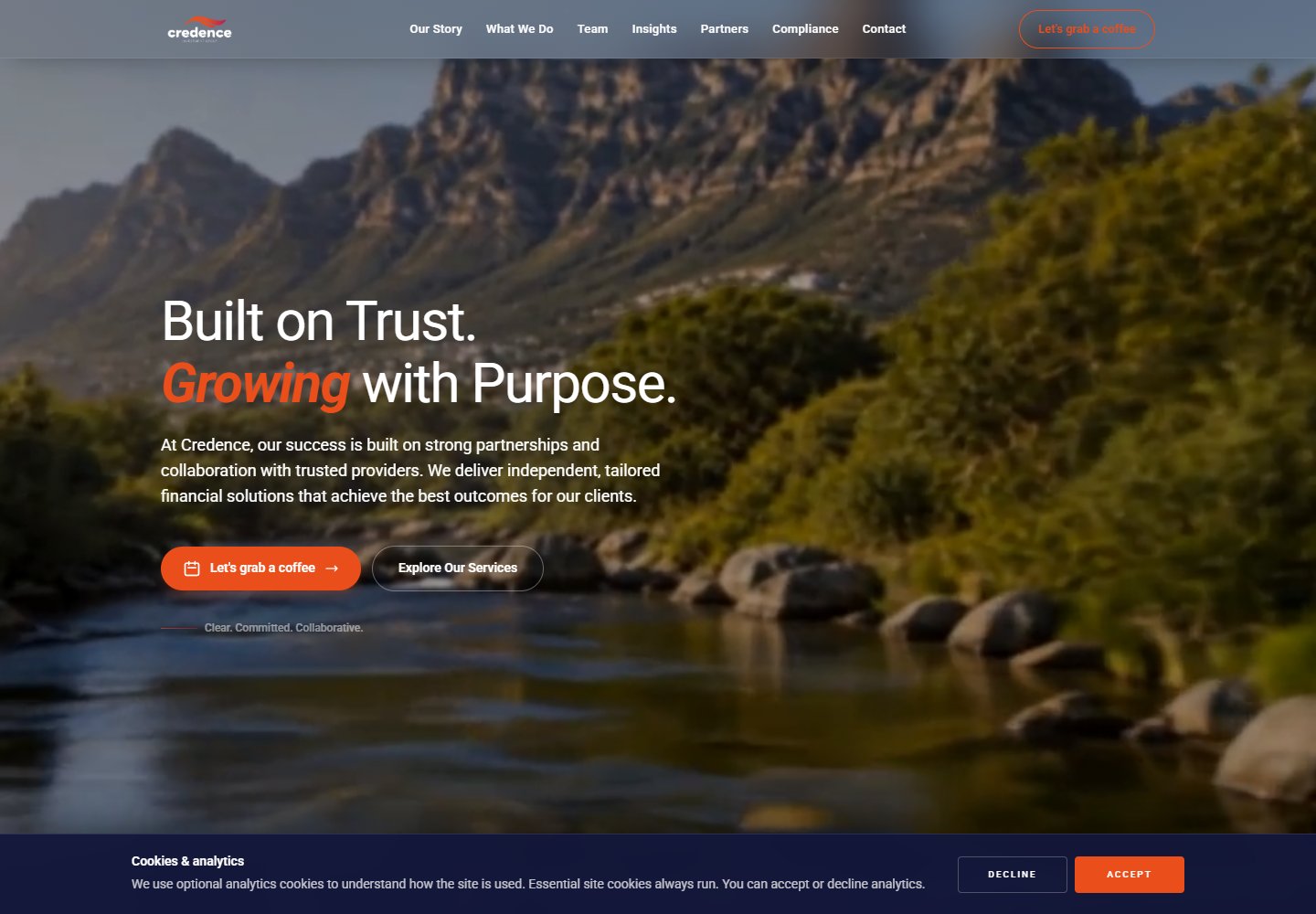
A first release with a narrow job
A launch page does not need to pretend to be a finished platform. My Credence work centres on giving the brand a recognisable web presence and making it clear how someone can get in touch while the wider experience takes shape.
Type, colour and a contact path
The earlier Nuxt version uses a single-page layout, a strong typographic identity and a navy-and-orange palette. I added a changing headline and a contact form with an email submission flow. That keeps the page small while still giving it a useful purpose.
A small page still has a lifecycle
The earlier Nuxt implementation combines a changing headline with a contact-form email flow. The animated copy is presentation state; the submission is an asynchronous action with a much more important outcome.
I would judge the form by its loading, failure and duplicate-submission behaviour before spending more time on animation. The public domain and earlier Vercel iteration are separate versions, so this technical account belongs to the inspected Nuxt build.
Two versions, different public surfaces
There are different versions of this project. The public domain now presents financial-planning and wealth-management content; the earlier Vercel version is linked separately. I keep that distinction because the code from an earlier iteration should not be mistaken for everything currently deployed.
Restraint in a launch page
For this kind of work, restraint is a technical decision too. The first release should communicate clearly and provide a next step, rather than collect features just to feel bigger.